 Sonja_Bauernfei
Digital Support
- Mark as New
- Bookmark
- Subscribe
- Mute
- Subscribe to RSS Feed
- Permalink
- Report Inappropriate Content
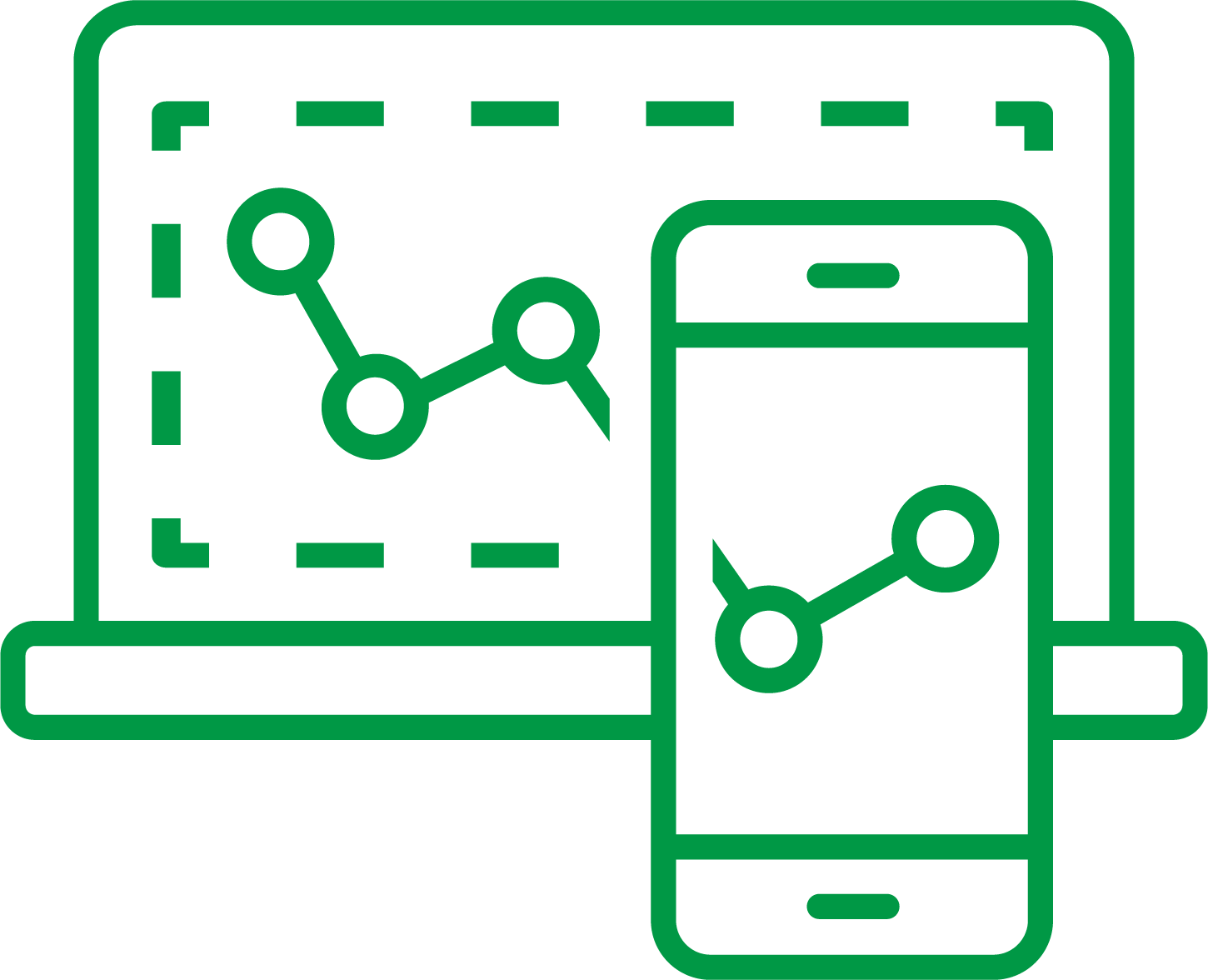
Qlik Sense visualization for iPad/mobile device or smaller screen resolution is different from Desktop.
Last Update:
Jul 24, 2023 2:46:13 AM
Updated By:
Created date:
Apr 15, 2017 4:20:24 AM
The visualization of Qlik sense sheet objects is not the same on mobile devices such as ipad and mobile phones compared to the visualization on a PC screen.
This is because Qlik Sense is responsive (adjusts according to screen size). For instance, if you compare the display size and alignment of objects in browser and mobile device, you will notice that the objects' size and alignment adjusts according to screen size.
Smaller screens require gestures such as clicking on the object to have a larger view. More details on this can be found in the following links:
While designing a dashboard there are two main things to be taken care,
1. Resolution size of the Client machine/device. (Note: This is mainly needed when using custom extensions in the dashboards. Since the default visualization like Bar Chart, Pie Chart from Qlik sense package are responsive enough to change the size and width automatically, however, when using custom extension the visualization designed would not be auto responsive.
2. When using custom extensions visualization or default visualization. Test the behavior using different resolution size. This can be tested in F12 (developer tool) in chrome browser and click on Toggle Device Toolbar for simulation to know the exact behavior.

2,651 Views